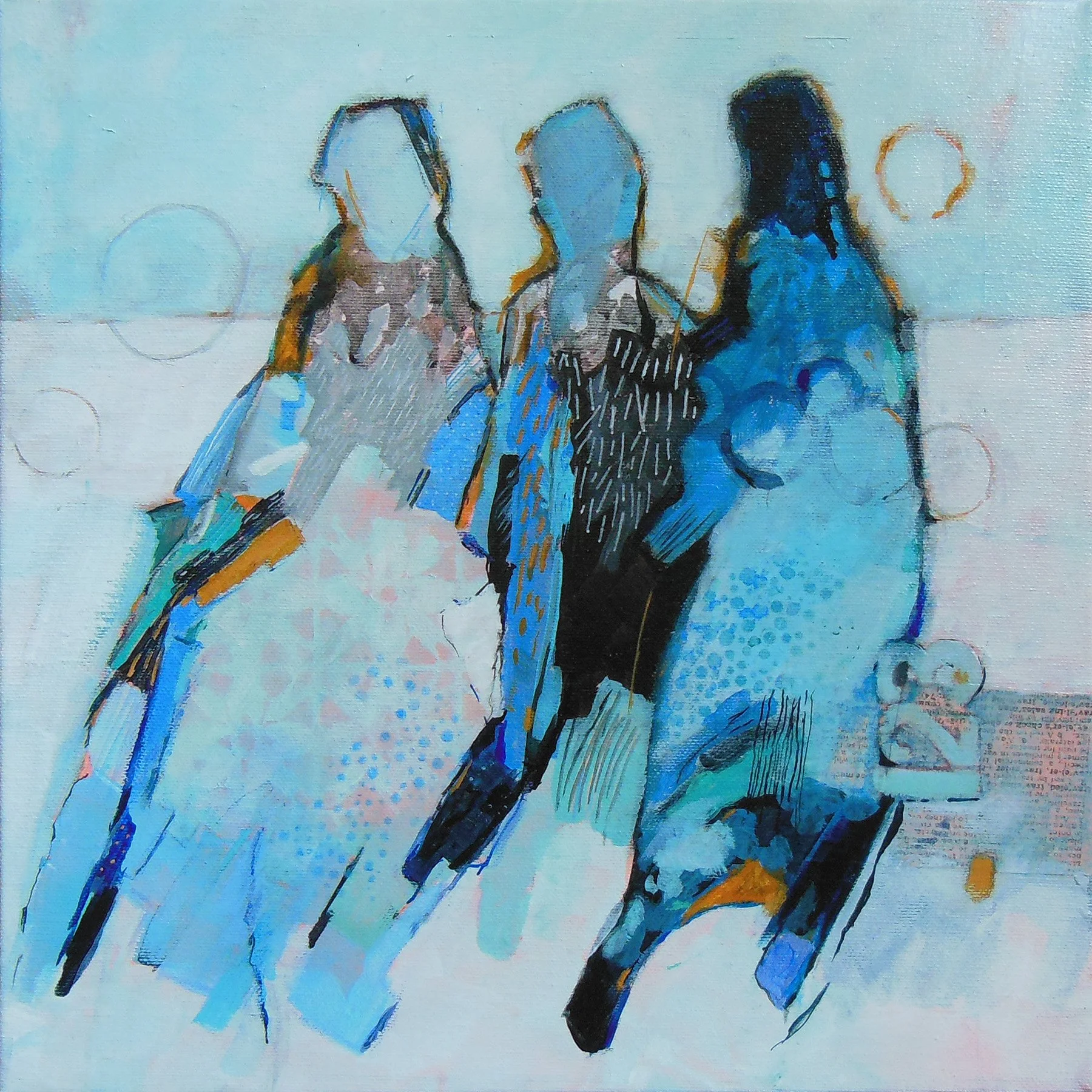
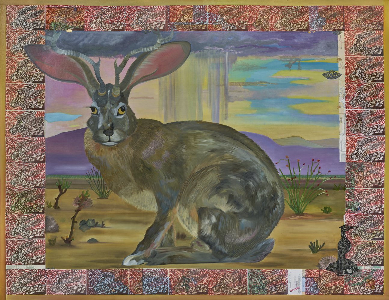
Jazz Williams is a fine arts trained mixed media artist specializing in portraiture and fiber. Williams creates Afro-Fantasy paintings using dyed fabric, oil paints, and elements of collage. She creates fantastic compositions in natural settings, incorporating her own mythology to portray the many experiences of Black women and femmes navigating the world.
In the following interview she speaks about her art and process with Touchstone intern Charmaine Mapp (a senior at George Mason University).
Charmaine Mapp: You use a lot of natural elements in your work from incorporating plants and animals to using fabrics and dyes. How would you describe your relationship with nature?
Jazz Williams: As far as my relationship with nature is concerned, it’s probably not as well acquainted as some would expect. I do have a real love for nature as an aesthetic but when it comes to feeling connected to nature, I mainly use nature for a sense of place. Within my work, I use plants and animals from the East Coast, mainly the DMV, but sometimes all the way down to Florida because that’s another homebase of mine. [Nature] is something I use to feel grounded. I was really drawn to media and TV shows that use the concept of being “lost in the woods” as a premise. Coming-of-age always comes with a sense of feeling lost.
CM: What initially drew you to using fabric as your primary media?
JW: It was introduced to me through my art schooling. I’ve been in art school since middle school, so as I get older, I am getting more of a fine arts standpoint when it comes to work. I took up fibers because I wanted to try something new. I realized that I had so much experience under my belt in drawing and painting that I needed to put something else into [my art] to make it feel real. I started using fibers and dying things because MICA (Maryland Institute College of Art) has an amazing fibers program that goes in all different directions. I was really drawn to dying fabrics and it made me start thinking about the actual material I was using to dye. I figured once I started buying lightweight canvas and processing it in different ways, I could change my way of image making and make my painting process something a lot deeper. The fun actually starts when I get to dying canvases and at some point, I figure out what I want to put on top [of it]. [Using fibers] is just something I do to break up the monotony of painting. It’s a good way to let loose and not feel so controlled by my medium.
CM: Animals and women are recurring subjects in your artwork. How do you decide what animal best suits the story you are trying to tell?
JW: I’ve always had this invisible narrative within my work where its Black women or Black femmes that are lost in the wilderness, finding their way out, or figuring out ways of survival, but not in such a literal sense. I’m drawn to the idea of coming-of-age and learning a lesson within yourself. That’s a deep spiritual image to make and there are a lot of different directions you can go with that. I start by using different poses and contexts then try to figure out what animal captures that moment well.
CM: Do you use in-person models as reference for your portraiture?
JW: I use reference photos. I really love archives, looking at older types of media, especially photography and drawing poses from them. I am also drawn to Black photography, more so photography in pop culture, like things we see from celebrities. Images that evoke some sort of sensationalism. I’m really drawn to those sparkly, beautiful images and how provocative those images could be. I have a folder in my phone with photos spanning from the 1950s or 1960s, images of newspaper clippings or even an old picture of Destiny’s Child. I never use the faces because I don’t want that person to be associated with the actual message of the portrait. I don’t want to use people so literally. I want [my work] to be more relatable.
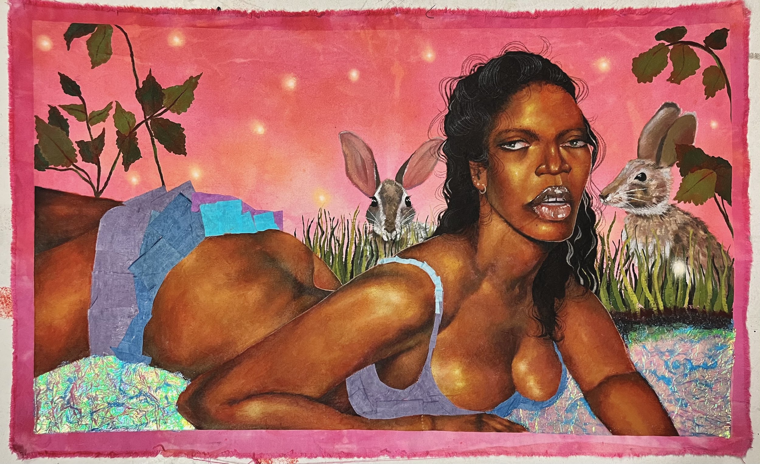
CM: In “Rot and Refuge (River Run-Off)” there are many visible elements of collage. Could you tell me more about this piece?
JW: I was getting experimental with that collage. When I started working in fibers, I had made my first dyed canvas piece and then I started thinking about how I could use fabric as a means of image and collage. I was looking for nontraditional ways of creating a canvas. That piece was built out of nine squares of colored cardstock that I collaged over with different sets of papers until it made some weird environment. I was really thinking about that Black coming-of-age. [In 2023] I was looking through old newspapers from 2020. It was a turbulent time, such an insincere time that came with a feeling of unrest. So, I had those images in the background for a reason. I made sure that they were something [the figure] was trying to look away from. You don’t always have to pay attention to all of the unrest in the world and think about how hard it is to survive, but rather just try to figure things out for yourself. That’s why it’s called River Run-Off, she (the figure) is running off to the river instead of having to deal with the rot and refuge of the world.
CM: Although your work is very stylistically realistic, there is a fantastical component to their compositions. Do you draw on any mythology to create your narratives?
JW: Yes, to a degree. Every animal and subculture, especially in nature, has its own stories. I was thinking about those kinds of narratives, but in terms of actual mythology, I feel like I create my own. I’m using animals that people would see on a daily basis but using whatever they symbolize as a story within the piece. I like to create my own narrative, my own kind of mythology.
CM: Is there a political element to the way you depict women in your art, perhaps making commentary on the objectification of Black women or portraying a reclamation of female sexuality as a form of empowerment?
JW: I would say a mix of yes and no. I’ve always liked provocative poses and clothing, but I was mainly focused on decentering the political element of Black portraiture. I felt like every time I made a painting it had to be a profound [statement on identity], but I wasn’t trying to do that. I just wanted to paint and make it so that we had these interesting, glamorous and over the top portraits of Black femmes. At some point [politics] became more of a conversation. I always talk about Mickalene Thomas because her work speaks volumes, painting Black femmes in a crazy, beautiful, and almost abstract light. I want [my work] to be an homage to the beauty standard and the vibe people get when they see and admire Black women versus the monolith that could be Black culture. Everything I use is a call back to what I’m seeing in the media. So that’s where my portraying of women comes from but “Whether or not it’s political?” “Yes and no.” Naturally, yes [my art] comes with that political statement but I wasn’t going for that initially.
CM: Are you interested in exploring anything new in terms of creating a different narrative?
JW: I have been driving myself more towards sisterhood and a sense of community. I usually portray a single figure. She’s in a strong pose or bonding with an animal but it seems so singular. I didn’t like the idea that being a Black woman meant being alone, though at some points [it does]. At some point I started thinking about what it means for the Black femme experience to be enjoyable, something that everyone can relate to. That sense of community, friendship, and love is something that I cherish in my life. More recently, there has been a shift in my work with joyful depictions of a Black femme or more than one.
CM: How would you define your art in a word or phrase?
JW: Fantastical. That’s what I try to go for. Something that is larger than life in more ways than one and tells a weird, folkloric story about the Black femme experience.