An Interview with Andrew Chalfen

Ash Newton, UMD Journalism student and Touchstone intern, interviewed Andrew Chalfen about his piece in the 2024 Iteration Reiteration exhibition.

Andrew Chalfen’s The Structure of Smoke is both an interpretation and subversion of patterns and repetition, the central theme of iteration reiteration. The intricate ink transfers create a complex array, but never repeat, while the painted wooden structure disrupts the rhythm of the piece by bursting out into three dimensions. The geometric shapes suggest algorithms or architecture, but their colors dazzle. When explaining the delicate balance of pattern and chaos in the piece, Chalfen says, “I rely on a mix of intentionality combined with a certain amount of randomization.” 

Ash Newton: What is your intent in creating this artwork?

Andrew Chalfen: Several answers, I suppose: I make art because that is what I do. Indeed, I feel compelled to do it and get antsy when I don't (same goes for creating music). I'm also following paths to see where my various aesthetic interests lead. "The Structure of Smoke" is the latest iteration of my exploration of certain forms (painted sticks, drawings used as ink transfers) and ways of using those forms in various arrangements/compositions. This path-following is a primary driver in what I do, asking the question "What if I do this?' and seeing how the work responds to that. I want to make work that coheres, makes aesthetic sense, is pleasing to the viewer. My pieces seem to suggest things, such as architecture, data, play, urban densities, etc without actually being those things. It not only involves a lot of puzzle solving and hopefully a few a-ha moments, but also a trust in the processes I've gradually developed over the years. I rely on a mix of intentionality combined with a certain amount of randomization. I make each stick and drawing not knowing exactly in what position it'll wind up in a work, or even in which work it'll end up. Thus, once I settle on a compositional strategy, I know generally in advance how a piece will turn out, but not specifically.

AN: I really like the way your work handled the exhibition's theme. Was the backing pattern predetermined?

AC: The general overall look of the backing pattern is something I have in mind in advance. However, there's a lot of randomization and chance involved at various points. The background is composed of many individual ink drawings, which tend to come into being in a pseudo-fractal manner as I make them. For the ink transfers, I used to use the original drawings, destroying them in the process, which after a while kind of bummed me out. Here I've spent all this work on a drawing only to have it used once and get destroyed. So I started scanning my drawings and printing them out and using the printouts to make the ink transfers. So I've got a growing library of scans of drawings I can pull from to create these complex assemblages. Plus the images are reversed due to the transfer process, adding another layer of unpredictability. The black and white of the drawings is a nice contrast to the colorful sticks. It's my current iteration for a background. In the past I've used solid gold fields, dark purple fields, various pale cloudscapes, just trying out different ideas.

AN: How was the wood structure constructed?

AC: I've developed a kind of factory line for stick creation. I take square dowels of various thicknesses, prime them, saw them into a variety of lengths, paint them on all sides, using painter's tape to get as clean a line as I can get, then varnish them. I want each stick to make aesthetic sense on its own, almost as a stand-alone piece of art. I figure if they look good individually, they'll look good massed. This has more or less worked out. I like to have a lot of painted sticks on hand when I begin to assemble a structure so I can hone in on what sticks go with what's already been constructed in terms of look and size. More puzzles to solve. After the background is completed and varnished, only then do I start gluing sticks to the panel and to each other. Once I've glued a stick down, I've committed. There's no undo. I have to be able to live with all my previous decisions. I kind of like that limitation (I kind of like having a lot of limitations. There are plenty of decisions to be made without the possibility of infinite options.) After I add each stick, I take a look at the overall composition to see where I feel the next stick needs to go and what color and shape it should be. At some point adding an additional piece feels like it would detract from the composition. That's how I know I'm done.

AN: Does putting art up for sale change its function? 

AC: I don't think so. I suppose this gets into what the purpose of art is in society and for the individual.  Plus artists have to eat. I guess I could just give away my art and music, but I feel an artist should be compensated for the work they do, just like anyone else.

AN: Do you care what the owner does with it?

AC: Hopefully they'll hang it on their wall and appreciate it! A lot of my pieces have no "up" - they can be hung in any 90 degree orientation. In fact, I wire a lot of my work with two wires so that the possessor of a piece can occasionally change up their viewing perspective. For me, I want people to enjoy my work, have things about it revealed slowly over time by observation. I'd rather have my art be in people's homes or, knock wood, a museum or two, than to have my home fill up with my works until I move along to the next astral plane. Maybe it's the performer in me, but I want others to enjoy/experience my work. Nice for someone to see art with a fresh set of eyes other than mine.
An Interview with Joy Nutt

Touchstone intern Talia Desai, a University of Pennsylvania student, interviewed Joy Nutt about her piece in the 2024 Iteration Reiteration juried exhibition.

Joy Nutt’s An Alternate Route is a vivid exploration of colors and patterns. The title comes from the initial vision for the piece changing overtime. Nutt painted this piece by placing large sections of color on the canvas and then later painting patterns on top. However, as she painted, she found herself repainting these sections. The artist embraced this evolution and idea that sometimes you have to take “an Alternate Route” in life.

When speaking about the inspiration for the piece, Nutt says, “This particular painting draws inspiration from the crazy quilt tradition in which scraps of leftover fabric are pieced together with simple or embroidery applique techniques. I think of each area of the painting as an opportunity to create a small piece of fabric, so kind of working in reverse of what a quilter would do.”

—-

Talia Desai: In what order did you paint the patterned sections and borders? Did the borders come first or the sections?

Joy Nutt: I started this painting with large areas of color only. The areas of color determine the sections of patterns. I decide what kind of pattern would look best against the background color and use found objects or traditional painting techniques to create the patterns. The black outline is the last step.

TD: Do the shapes of the borders reference anything in particular?

JN: No. It’s organically determined by the shape of the background colors.

TD: How long did it take to paint this piece? Did your vision of the end product change overtime?

JN: A painting of this size takes anywhere from 3-5 days if I’m working on it periodically. I never know what the end product will be when I start. I let the colors and patterns lead the way. The end product was different from how it started which answers the next question.

TD: How did you come up with the title?

JN: I was not satisfied with how the painting was going. I felt like I was trying to force patterns and colors together and it wasn’t looking cohesive. I painted over most of the canvas and only left a small portion of the original painting. I started over from the beginning of the process by adding areas of colors next to each other and then adding patterns on top. The title comes from the idea that you may start out going in one direction but end up having to take “An Alternate Route” along the way.

TD: Did you have a specific route/place in mind when creating this piece?

JN: No. It’s not based on a real or imaginary place. I was thinking more of how the colors and patterns interact with each other.

TD: How do you feel about being showcased in an exhibition with multiple quilts when you draw inspiration from quilts?

JN: I love it! I think of quilts as a form of fine art. I like how they can be geometric or organic. This particular painting draws inspiration from the crazy quilt tradition in which scraps of leftover fabric are pieced together with simple or embroidery applique techniques. I think of each area of the painting as an opportunity to create a small piece of fabric, so kind of working in reverse of what a quilter would do.

TD: How does the use of repetitive patterns impact your work?

JN: Patterns are essential to the work that I create. I like the challenge of coming up with as many pattern combinations as I can in one painting

An Interview with Anne Stine

Touchstone intern and GW Art History Grad Student Thea Polsky interviewed Anne Stine about her piece in the 2024 Iteration Reiteration juried exhibition.

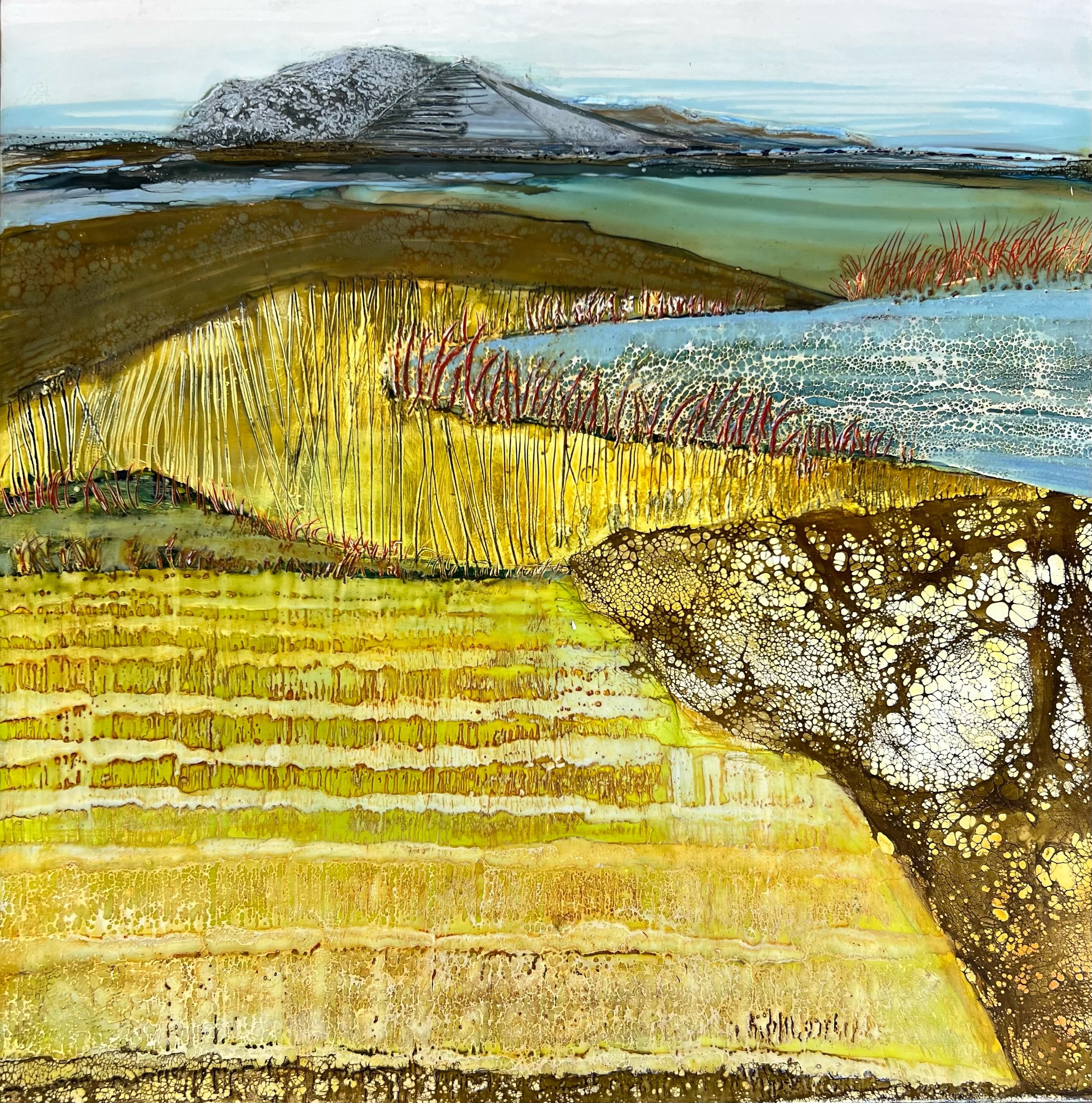
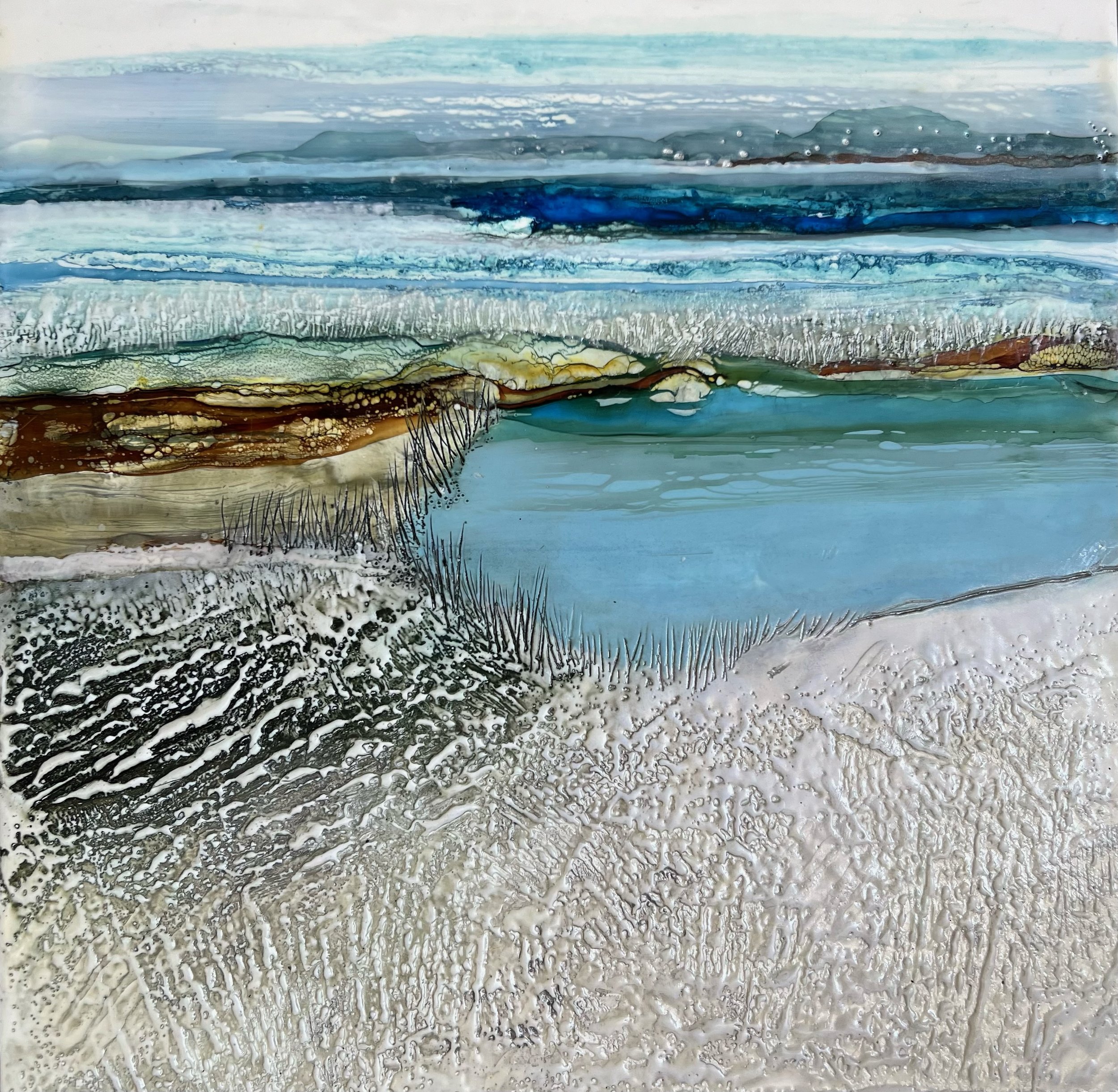
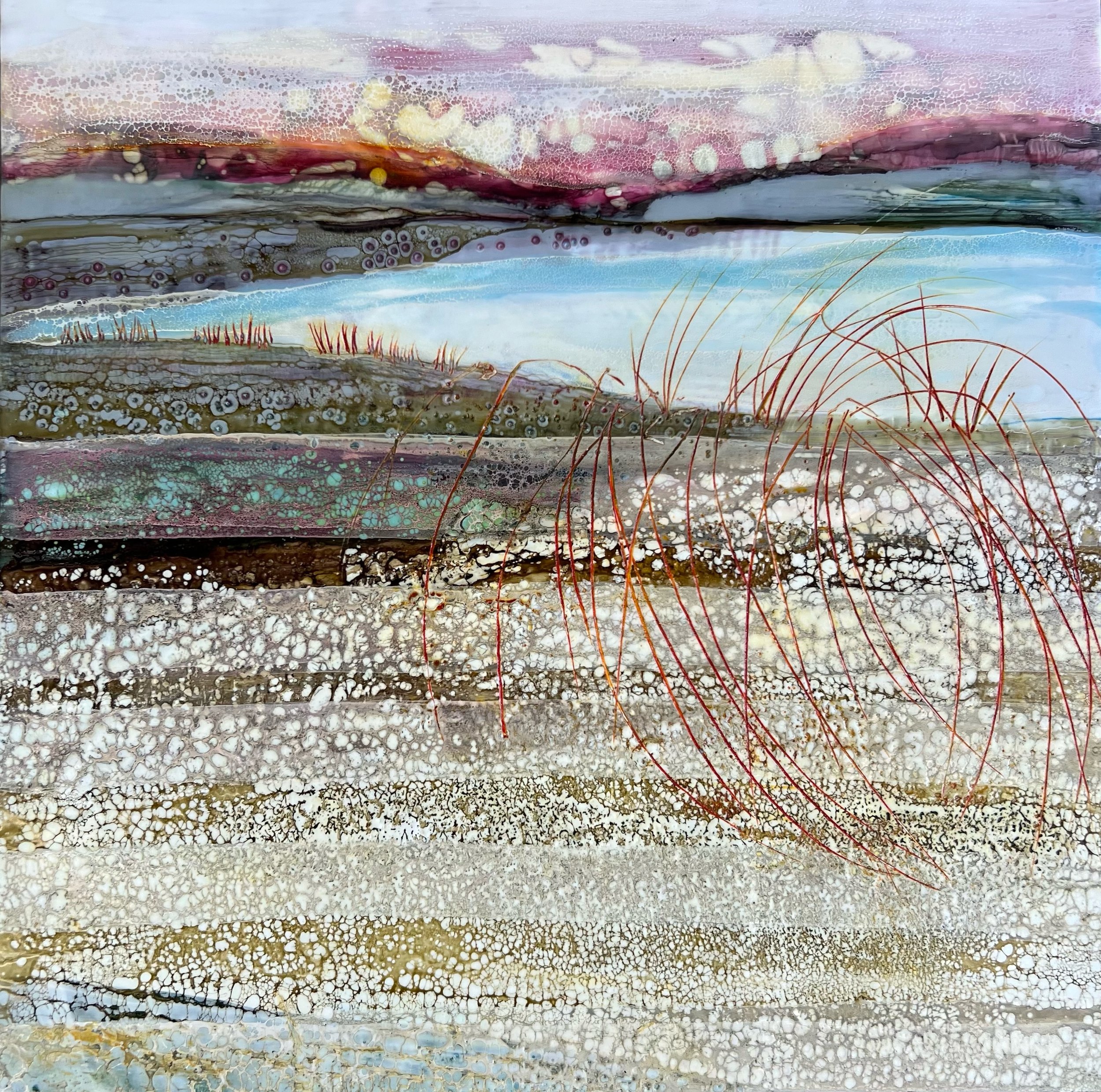
Love is Heavy and Light, a title from Shakespeare’s Romeo and Juliet, captures the duality and complexity of love. The heavy rock formation imagery of the composition symbolizes the weight and intensity of affection, while the light colors and ethereal quality represent the work’s uplifting and delicate aspects. These rock formations build off each other, creating a kind of community where each member lovingly supports one another.

The use of encaustic painting captures the vibrant colors, fluidity, and textures of nature like no other medium. Using handmade beeswax paint, multiple translucent layers are created and invite viewers to explore the hidden depths of the surface. This encaustic process of layering and fusing with a blowtorch over and over embodies the show’s theme of repetition and refinement.

It’s the unpredictable nature of the piece’s medium that is truly inspiring and in its finished state has an overall balance of form, shapes, value, edge, and color.

——————

Thea Polsky: What led you to choose encaustic as the primary medium for your work?

Anne Stine: Encaustic painting lets me capture the vibrant colors, fluidity, and textures of nature like no other medium. In my abstract landscapes, I love to showcase vivid colors, dramatic textures, and a luminous quality. Using my handmade beeswax paint, I create multiple translucent layers that invite viewers to explore the hidden depths of the surface. The sculptural quality of the wax allows me to build textures that bring my work to life in a tactile way.

With a blowtorch in hand, I fused each layer onto a wood panel. I then gouge, scrape, and drip the wax to form impressionistic and abstract images of landscapes, waterways, and other natural scenes. It’s the unpredictable nature of the encaustic process that truly inspires me to push the boundaries of the medium and my imagination.

TP: How does the title relate to the artwork? 

AS: I chose the title, Love is Heavy and Light, from Shakespeare’s Romeo and Juliet because it captures the duality and complexity of love. The heavy rock formation imagery in the composition symbolize the weight and intensity of love, while the light colors and ethereal quality represent its uplifting and delicate aspects. This juxtaposition within the painting reflects the idea that love can be both a burden and a source of joy, much like the verse suggests. I also see rock formations as representing a “community” of individuals where each member lovingly supports one another.

TP: Tell me more about the abstract elements of your artwork.

AS: It’s much like a dance when I create an abstract landscape. I first start with a base painting where the composition is loosely etched in with mixed media mark making to capture the overall flow and connection of forms in the painting. Here, I allow myself the freedom to express whatever comes to mind knowing there will be an opportunity to edit the base at a later stage.

Next, I apply clear encaustic medium to protect the base and decide on the palette that I’ll choose depending on the message of the artwork. In this painting, I chose a soft cool palette of greys and blues with subtle warm notes of creams and browns to reflect the soft feeling of being in love.

I continue adding encaustic paint to create the larger forms progressing each step to smaller and smaller shapes as a way of adding interest and detail.  Lastly, I go back and add expressive marks or scrape a variety of lines for a feeling of movement and whimsy. I feel that the painting is finished when there is a balance to form, shapes, value, edge, and color.   

 TP: How does Love is Heavy and Light exemplify the theme of Iteration Reiteration?

AS: The artistic process itself of creating multiple translucent layers of beeswax paint is a direct form of iteration. Each layer builds upon the previous one, adding depth and complexity to the artwork. This process of layering and fusing with a blowtorch over and over embodies the theme of repetition and refinement. The repeated use of rectangular and square shapes in the artwork mirrors the natural patterns found in rock formations.

French Connections: Part III

The third and last article in the French Connections series on Touchstone artists and their links to France. Intern Emma Cunningham-Bradshaw spoke with McCain McMurray about his experience at an artist residency on the southeast coast of France. McCain was inspired by the environment there more than he usually is, and painted many pieces named after particular towns along the Côte d’Azur. He painted with lighter colors, reflective of the luminous colors around him, while retaining his signature architectural style. You can also read the other articles in the French Connections series (Part I and Part II)

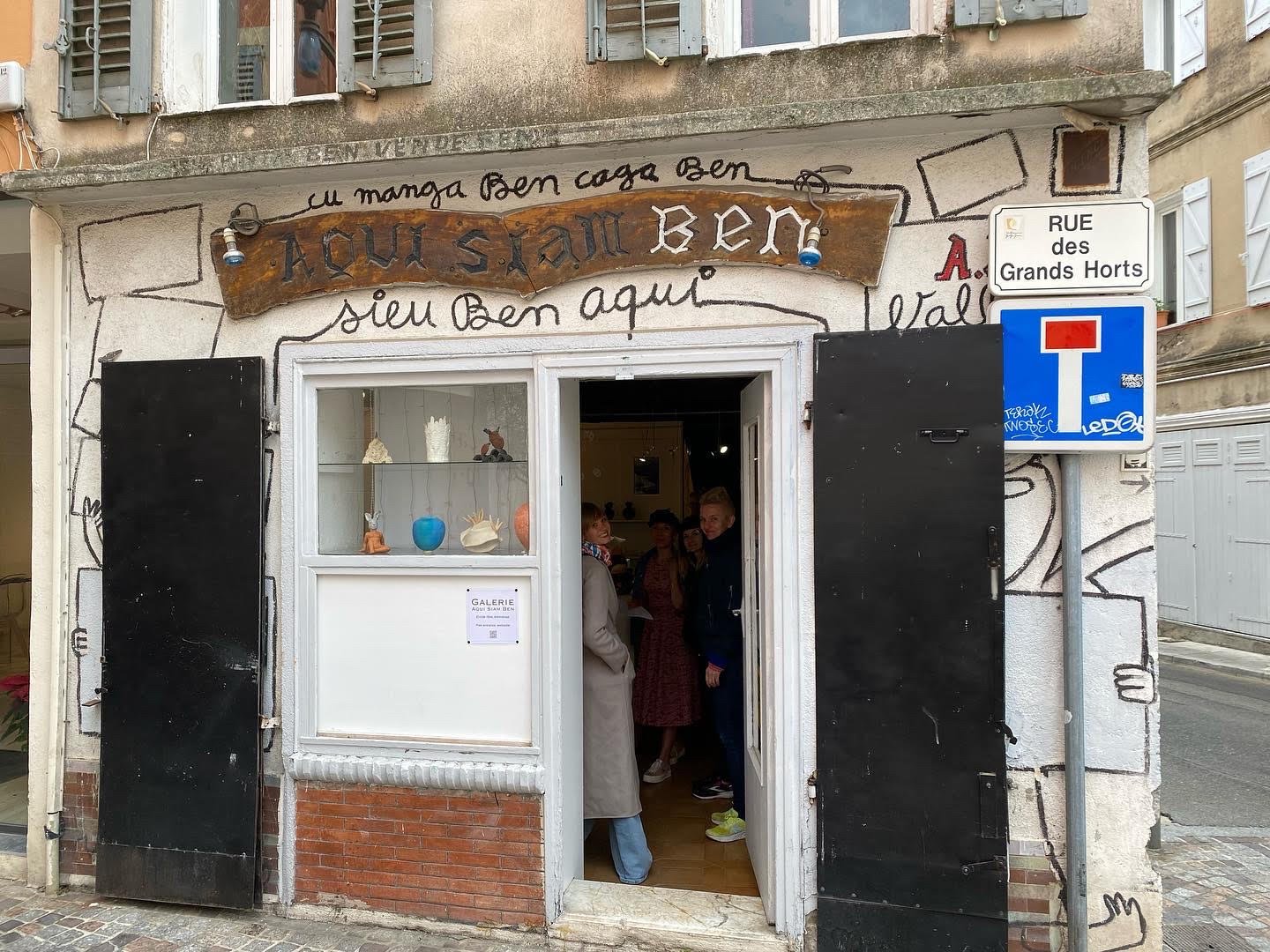
This past April, McCain McMurray traveled to France for a five week long artist residency. The program is called Artists in Residence (AIR) in Vallauris, a town on the southeast coast of France, not too far from Italy. For centuries, Vallauris has been famed for pottery, and had a boost in notoriety when Pablo Picasso moved there in the 1950s. For the last 15 years, McCain has traveled to France with his husband who works for the French Embassy. McCain’s familiarity with France along with the many artists he’s fond of with connections to the country, such as Nicolas de Staël, propelled his desire to do a program there. He was looking for a small residency on the coast and found AIR which typically has only five artists in residence. They live in a building owned by the program on Place Lisnard and around the corner is the studio where they work. “We were essentially all free to do whatever we wanted. We foraged for ourselves, we had a kitchen and a living room and we were all in the studio basically every day.” 

A view of the square and chapel on Place Lisnard, Vallauris

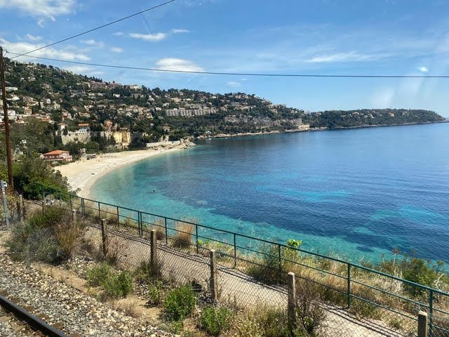
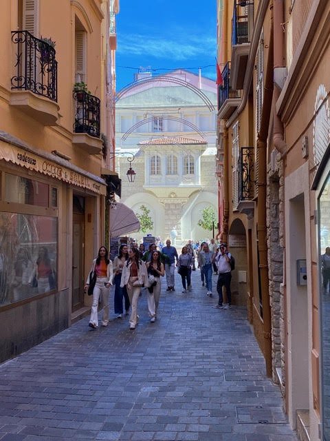
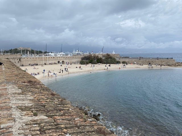
McCain had expected to be inspired by the light and colors of the French Riviera. “I’ve done a lot of stuff that’s related to water, particularly blue ocean water, as opposed to lake or inland waters.” While in Vallauris, he frequented stops on a train that runs from Marseille all the way up to Ventimiglia, Italy, cities such as Cannes, Antibes, Nice, Monaco, Roquebrune-Cap-Martin, and Menton. He also frequented Golfe-Juan, a coastal village between Cannes and Antibes. “I love that place because it’s not fancy. I’d ride the bus down there for lunch.” More than is usual for him, McCain’s work while at AIR was inspired by the cities he visited. One story he tells is illustrative of how the environment affected him. “I went to Cannes to change money, and I walked down the croisette and was so struck by how white all the buildings were. It just really blew me away.” Prior to this, he was painting with darker colors, somber blues and reds. In Vallauris, he started painting with lighter colors. “That white, the silvery color, and the lighter blues were very appealing to me. The sky is such an intense blue down there, and I would typically make that very light. So most of my colors were in the blues and the whites and I’m a big fan of silver so I use a lot of that.” One might notice this silver in the rocks along the water. “The Mediterranean is not really beachy, in terms of sand beach, it’s very rocky.” Further revealing how the cities inspired him, most of his pieces from this period are titled the names of cities along the Côte d’Azur. 

Vallauris 05

McCain was an architect for decades before fully taking on painting. He calls his work ‘geometric abstraction;’ it is strongly rectilinear. In France, he was less harsh with the rectilinear rigor in his art. “I became a little looser in terms of the way I applied the colors, the colors I used, the way I manipulated them. I didn’t overwork the pieces like I sometimes do.” McCain brought six 8 by 8 cradle panels and 12 pieces of canvas with him for the residency. He serendipitously had a squeegee (which is his preferred tool for painting) that was the same width as his rectangular panels. “I would put different colors on the canvas and then pull the squeegee through. Happenstance and coincidence would create whatever color or texture the pulling might create. Within that is not one color, it could be a variety of colors as those colors mix together. I really enjoy the spontaneity of what might come up, but within that fairly distinct medium.” His interest in water and blues has been a throughline in his work. I ask him how flowy water fits into his rectilinear style. His answer: he doesn’t see water as flowing. “In terms of geometry, the color variation of the water is very appealing to me. Water is of course, not really blue, it’s a variety of blues and greens and turquoises.” 

Despite being so inspired by his surroundings, McCain didn’t paint from photos, or even memory strictly speaking; he was always intently focused on color. “I would mix a color and like it and put it on a canvas, and then maybe I’d say, I want it lighter or I want darker, or I want it greener or I want it greyer.” He mixes colors in take out containers and keeps a lid on them so they won’t dry out. “If I want to make a blue whiter, I’ll just put some white in, or if I’ve got two different blues, I’ll mix those together, so I’m constantly kind of developing colors and reusing colors.” He often screws cradle panels together, and paints them one color over and over again to develop the surface. “It is an attempt to have a color on top of another color, so you kind of see that there is something behind it or something within it.”

Nice, France

In Vallauris, McCain had many ideas about pieces he’d like to make. In the past, he’s screwed panels together so that the pieces of wood extend beyond each other. He’d like to explore that style again and this time use wood to create layers of planes with beams supporting them. The inspiration for this came from a very practical insight. “In Vallauris, I was going to make this piece and realized ‘you know, I can't get this home if I make it like this,’ so I did something else and it was this notion of layers of planes with colors that are fairly architectural and also fairly sculptural.” Currently in his studio, he’s arranged pieces of wood of different widths and thicknesses. He sees what he’s doing as similar to Louise Nevelson’s sculptures. “They’re not as animated as Nevelson, but they’re more architectural than Nevelson. One piece that I really liked, I just wiped white onto unfinished wood, so it had this really unpainted quality. I'm really debating about how I present these and use color to make the sculpture be one thing that’s not just a painted thing.”

The last weekend of the residency, there was an exhibition of the work the artists had completed that summer. “There were a lot of locals who came, about 30 people which was very surprising.” McCain has especially fond memories of that square, Place Lisnard, where their residency stood. “If you go on the weekend, the gallery will be open and the little chapel is right across. It’s a tiny, little wonderful place.”

Below is a slideshow of McCain’s own pictures from his stay.